Email:

ar.akashranjan@gmail.com

Email:

ar.akashranjan@gmail.com

Email:

ar.akashranjan@gmail.com

Back

4 Inside Design

4 Inside Design

Innovation in Every Inch

Innovation in Every Inch

A Design Vision Rooted in Accessibility

A Design Vision
Rooted in Accessibility

4 Inside Design isn’t just a studio — it’s a quiet movement reimagining how tier-2 India experiences interior design. Built on the belief that modern, thoughtful design shouldn’t be exclusive to metro cities, 4ID blends high-end aesthetics, practical function, and affordability in perfect harmony. Whether crafting cozy homes, vibrant cafés, or professional workspaces, every project carried one mission: to make design feel personal, modern, and within reach.

4 Inside Design isn’t just a studio — it’s a quiet movement reimagining how tier-2 India experiences interior design. Built on the belief that modern, thoughtful design shouldn’t be exclusive to metro cities, 4ID blends high-end aesthetics, practical function, and affordability in perfect harmony. Whether crafting cozy homes, vibrant cafés, or professional workspaces, every project carried one mission: to make design feel personal, modern, and within reach.

Project Overview

Project Overview

The task was to unify a multi-segment design brand under one flexible identity — adaptable across residential interiors, cafés, offices, and more. The new system had to communicate consistently across stationery, uniforms, site visuals, social assets, and digital media while staying true to 4ID’s belief in innovation that lives within reach.

The task was to unify a multi-segment design brand under one flexible identity — adaptable across residential interiors, cafés, offices, and more. The new system had to communicate consistently across stationery, uniforms, site visuals, social assets, and digital media while staying true to 4ID’s belief in innovation that lives within reach.

Problem Statement

Problem Statement

Despite a clear design vision, 4ID lacked the visual infrastructure to scale. The brand needed a system that felt elegant yet culturally grounded, premium but never intimidating, and versatile enough to work across modern, rustic, and traditional spaces — with a tone that felt aspirational yet relatable.

Despite a clear design vision, 4ID lacked the visual infrastructure to scale. The brand needed a system that felt elegant yet culturally grounded, premium but never intimidating, and versatile enough to work across modern, rustic, and traditional spaces — with a tone that felt aspirational yet relatable.

Industry

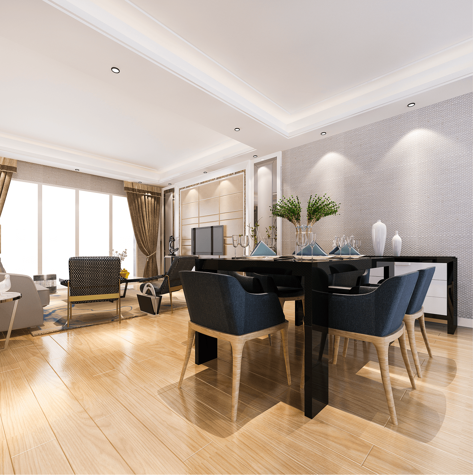
Architecture & Interior

My Role

Lead Designer

Touchpoints

Brand Identity

Collaterals

Timeline

july 2023 - October 2023

Where It All Began

4 Inside Design began with a simple observation: good design wasn’t reaching the people who needed it most. In tier-2 cities, modern interiors were often unaffordable or felt disconnected from everyday life. The intent was never just to decorate, but to create design that feels personal, polished, and rooted in purpose — something that balances aesthetics with real-world relevance.

Discover call Takeaway

What should a 4ID space feel like when someone walks in?

Functional, modern, and calm — without losing the warmth of a lived-in space.

What kind of design approach would you reject outright?

Over-styled, copy-paste trends that ignore real needs or daily use.

Who do you imagine coming back again and again?

Young homeowners, local entrepreneurs, and professionals building a lifestyle they’re proud of.

What should never be compromised in the brand?

Clarity in design. If it doesn’t serve the space, it doesn’t belong.

What’s one word you’d want people to associate with the brand?

Considered.

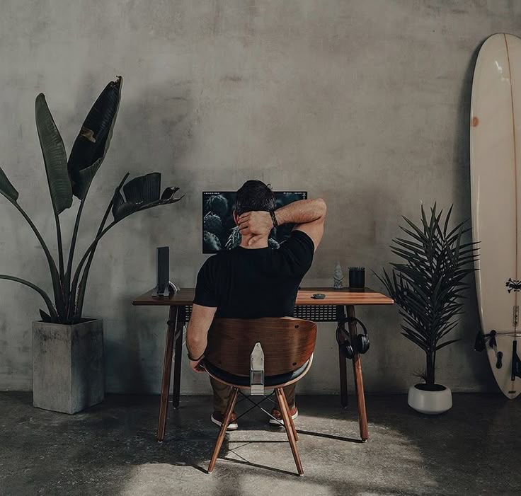
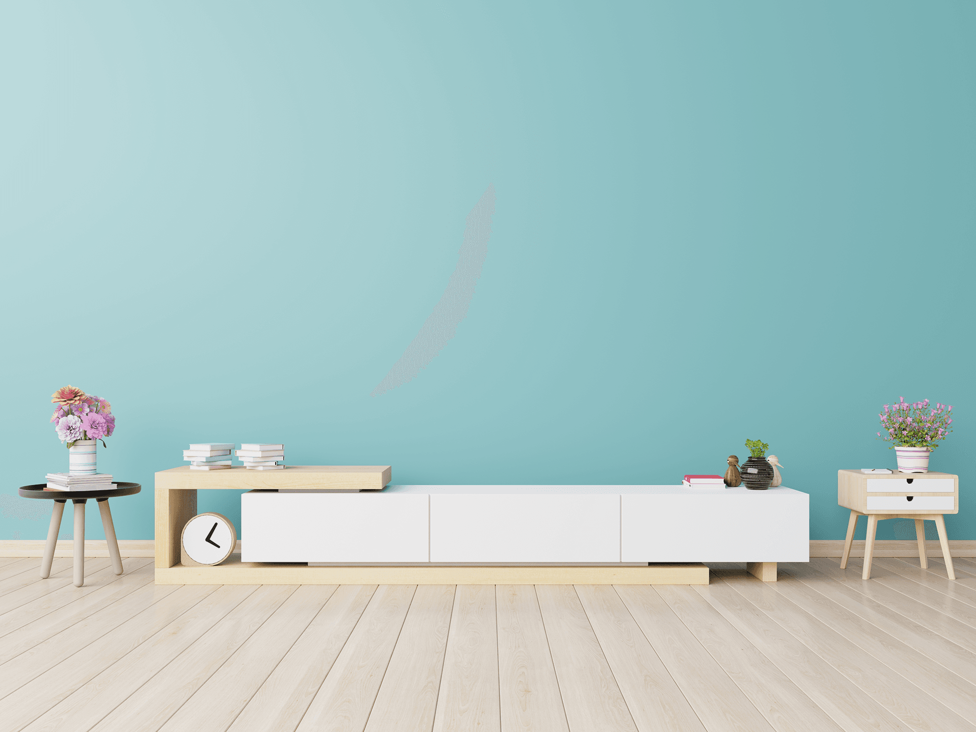
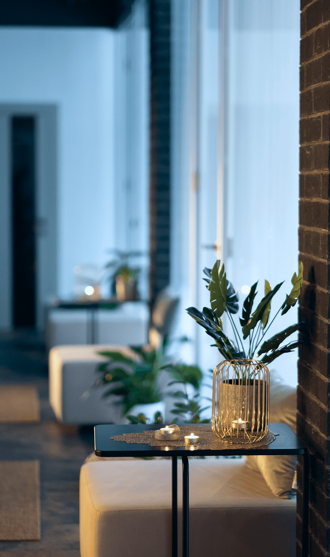
Moodbaord & Keywords

A refined mix of structured modernity and everyday warmth — tailored for the way tier-2 India lives, works, and connects.

Thoughtful

Approachable

Luxury

Calm

Minimal

Elegant

Functional

Personalized

Modern

Visual Stratergy

The design system was built at the intersection of principle, personality, and practicality. Every visual element — from typography and layout to how patterns respond across media — was shaped by the brand’s long-term vision and the values that matter most to 4ID’s clients: clarity, comfort, and creative integrity. Together, these layers formed an identity that feels refined, intentional, and remarkably relatable.

Design Principles

Minimalism with Intent

Structure & Flexibility

Emotional Clarity

Design Principles

Minimalism with Intent

Structure & Flexibility

Emotional Clarity

Design Principles

Minimalism with Intent

Structure & Flexibility

Emotional Clarity

Brand Anchors

Personalization

Innovation in Detail

Consistency Across Spaces

Brand Anchors

Personalization

Innovation in Detail

Consistency Across Spaces

Brand Anchors

Personalization

Innovation in Detail

Consistency Across Spaces

Client Priorities

Affordability

Accessibility

Warmth & Trust

Client Priorities

Affordability

Accessibility

Warmth & Trust

Client Priorities

Affordability

Accessibility

Warmth & Trust

Personas

Personas

Ravi Sinha

New Homeowner, Aspirational Thinker

“I want my home to feel designed — not just built. Something that reflects who I am without shouting about it.”

Age: 33

Location: Korba, Chhattisgarh

Tech Proficiency: Moderate

Gender: Male

Goal

Design a home that feels sharp, clean, and purposeful

Bring modern aesthetics into a tier-2 lifestyle

Avoid showroom looks — aim for comfort with character

Frustrations

Designers either go too local or too flashy

Hard to find studios that understand subtle, premium needs

Wants design advice, not just decoration packages

Meenal Dube

Boutique Café Owner, Detail-Lover

“The space should speak for itself. I want my café to feel raw, personal, and well thought out not like a Pinterest copy.”

Age: 36

Location: Raipur, Chhattisgarh

Tech Proficiency: High

Gender: Female

Goal

Build a space that attracts footfall and feels authentic

Combine rustic elements with clean lines

Work with someone who respects spatial storytelling

Frustrations

Most designers push generic café aesthetics

Struggles to explain non-verbal preferences

Feels excluded by places that push only “modern” without meaning
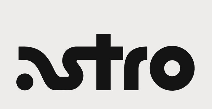
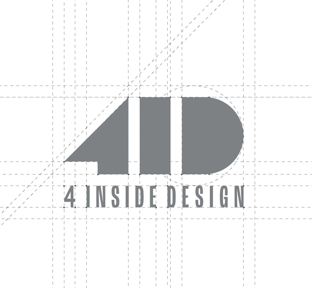
Process

Process

1. Discover & Immerse

Conducted founder discovery calls to understand intent, audience, and segment diversity

Studied existing project photos across residential, café, and office interiors

Identified recurring emotional needs: clarity, warmth, and space personalization

1. Discover & Immerse

Conducted founder discovery calls to understand intent, audience, and segment diversity

Studied existing project photos across residential, café, and office interiors

Identified recurring emotional needs: clarity, warmth, and space personalization

1. Discover & Immerse

Conducted founder discovery calls to understand intent, audience, and segment diversity

Studied existing project photos across residential, café, and office interiors

Identified recurring emotional needs: clarity, warmth, and space personalization

3. Design & Translate

Developed a modular logo and pattern system aligned to grid-based architecture

Built a visual language system (colors, typography, and layout usage guidelines)

Extended the brand into digital, print, environmental, and uniform-ready formats

3. Design & Translate

Developed a modular logo and pattern system aligned to grid-based architecture

Built a visual language system (colors, typography, and layout usage guidelines)

Extended the brand into digital, print, environmental, and uniform-ready formats

3. Design & Translate

Developed a modular logo and pattern system aligned to grid-based architecture

Built a visual language system (colors, typography, and layout usage guidelines)

Extended the brand into digital, print, environmental, and uniform-ready formats

2. Define & Frame

Extracted brand keywords from the ground up: calm, functional, minimal, modern

Sketched early visual directions with flexibility across space types in mind

Mapped design needs across three audience profiles: home, hospitality, commercial

2. Define & Frame

Extracted brand keywords from the ground up: calm, functional, minimal, modern

Sketched early visual directions with flexibility across space types in mind

Mapped design needs across three audience profiles: home, hospitality, commercial

2. Define & Frame

Extracted brand keywords from the ground up: calm, functional, minimal, modern

Sketched early visual directions with flexibility across space types in mind

Mapped design needs across three audience profiles: home, hospitality, commercial

4. Validate & Refine

Stress-tested the identity across different use cases — print, signage, digital

Reviewed brand feel against real personas: young homeowners, café owners, founders

Finalized a scalable brand system rooted in both strategy and aesthetic continuity

4. Validate & Refine

Stress-tested the identity across different use cases — print, signage, digital

Reviewed brand feel against real personas: young homeowners, café owners, founders

Finalized a scalable brand system rooted in both strategy and aesthetic continuity

4. Validate & Refine

Stress-tested the identity across different use cases — print, signage, digital

Reviewed brand feel against real personas: young homeowners, café owners, founders

Finalized a scalable brand system rooted in both strategy and aesthetic continuity

Logo Concept

Designed to be timeless and deeply memorable, the 4 Inside Design logomark leverages bold, simplified geometry to create a distinct yet versatile form. Built for subconscious recall, the block-like structure is intentionally minimal — crafted to leave a lasting imprint through repetition and familiarity. Its clean, modular silhouette aligns with the brand’s ethos: thoughtful design that balances clarity, function, and quiet confidence.

CMYK-30:73:57:13

CMYK-30:73:57:13

CMYK- 30:73:57:13

CMYK-07:18:30:00

CMYK-07:18:30:00

CMYK-07:18:30:00

Satoshi

Satoshi

Satoshi

CMYK- 100:86:41:41

CMYK- 100:86:41:41

Aa

Aa

Aa

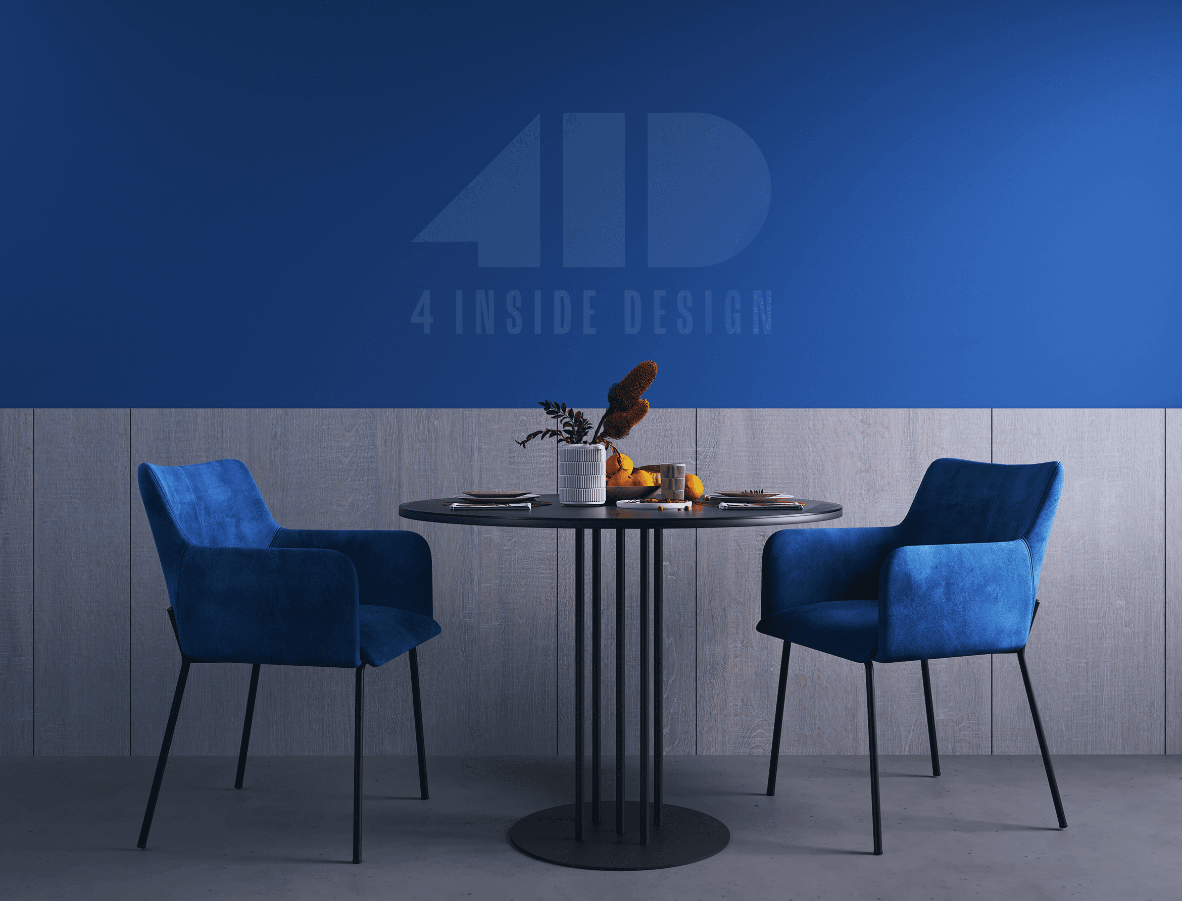
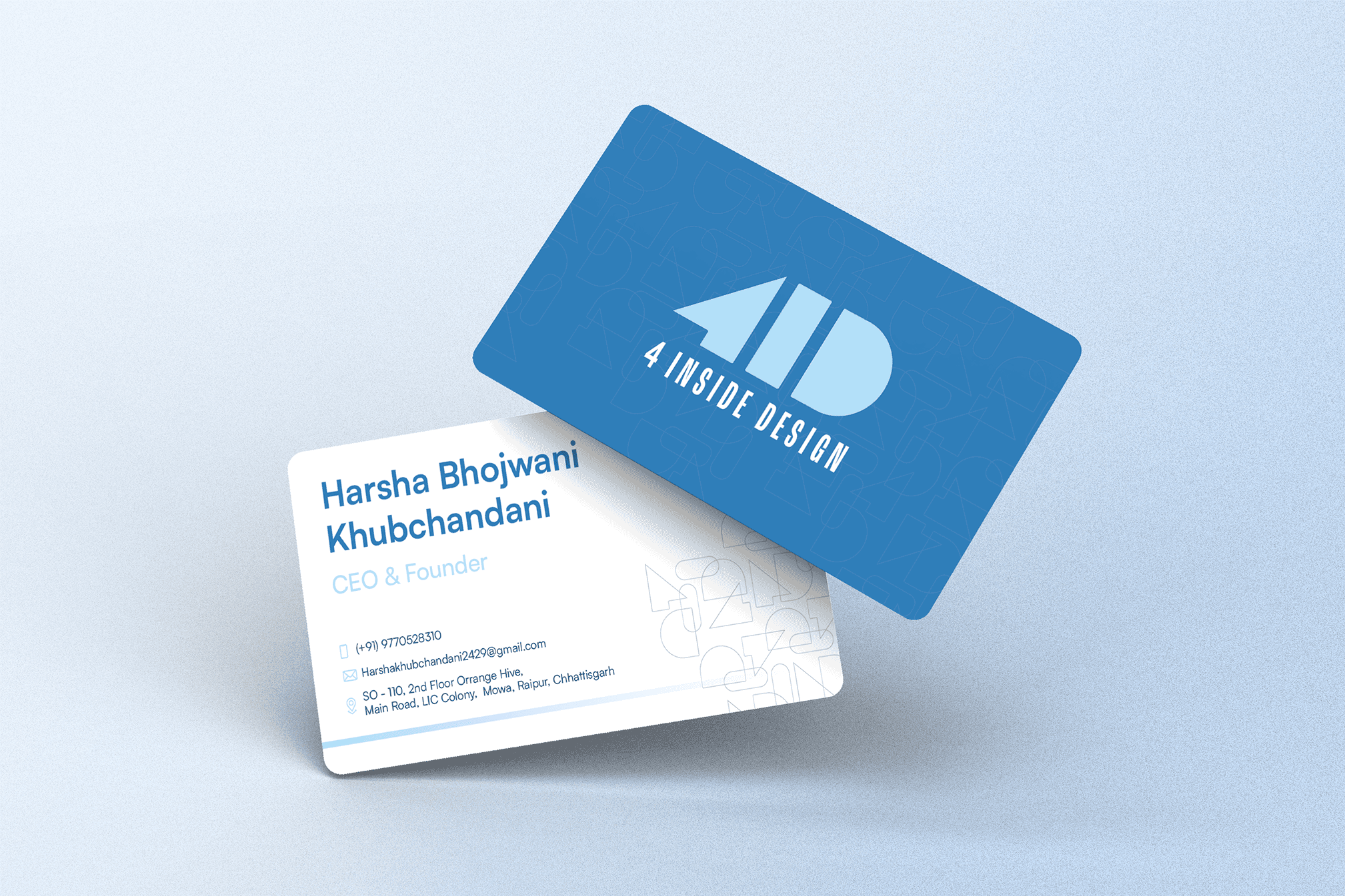
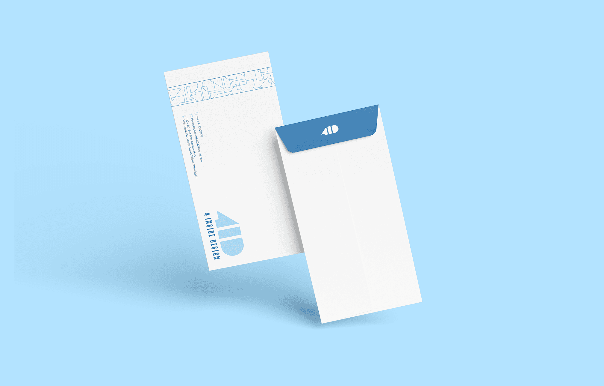
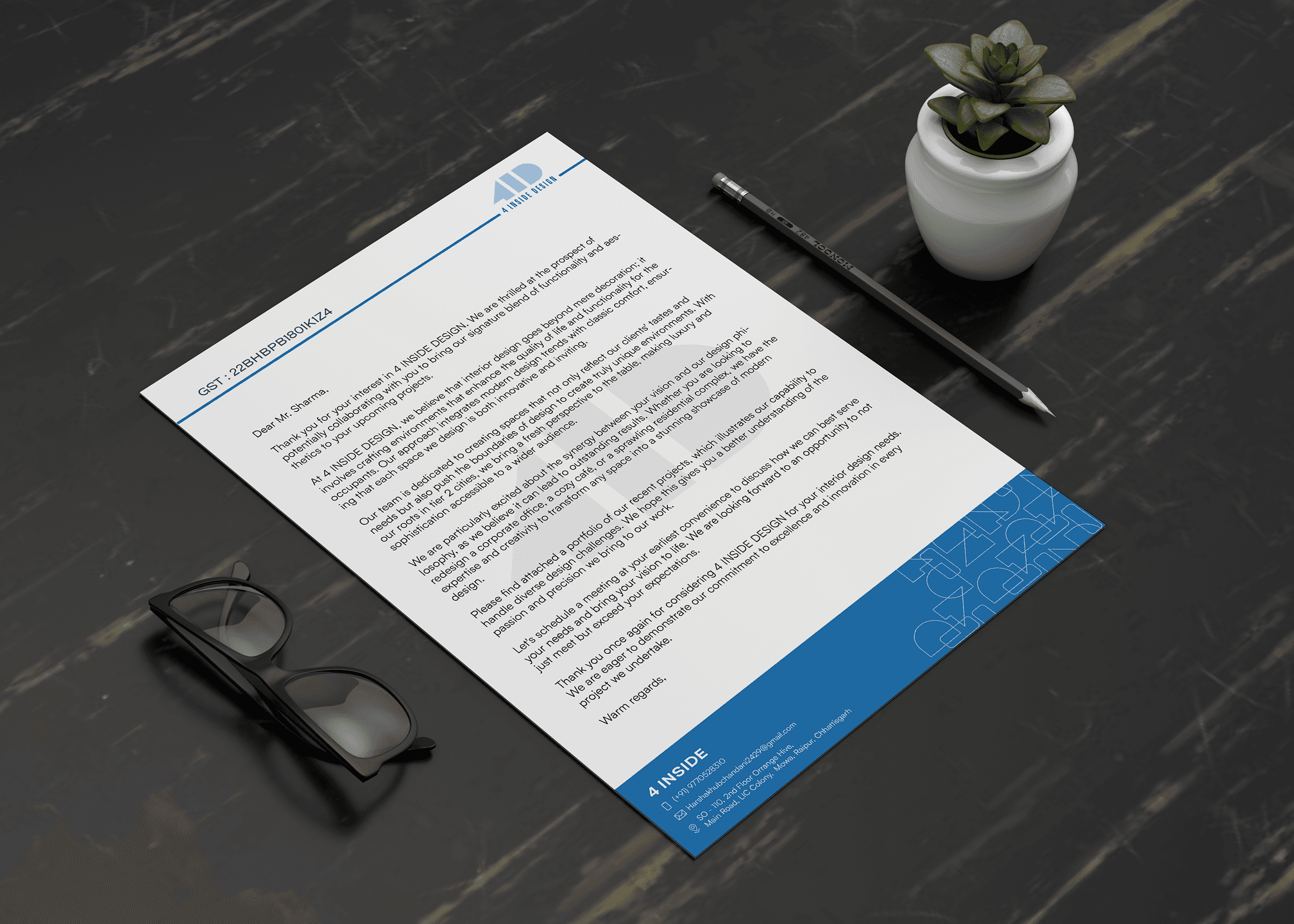
Visuals to Touchpoints

Every touchpoint — from business cards to room signage — was designed to feel intentional and quietly confident. Rather than relying on visual excess, the identity leans on structure, negative space, and precision to create a presence that’s polished, memorable, and deeply rooted in everyday function.
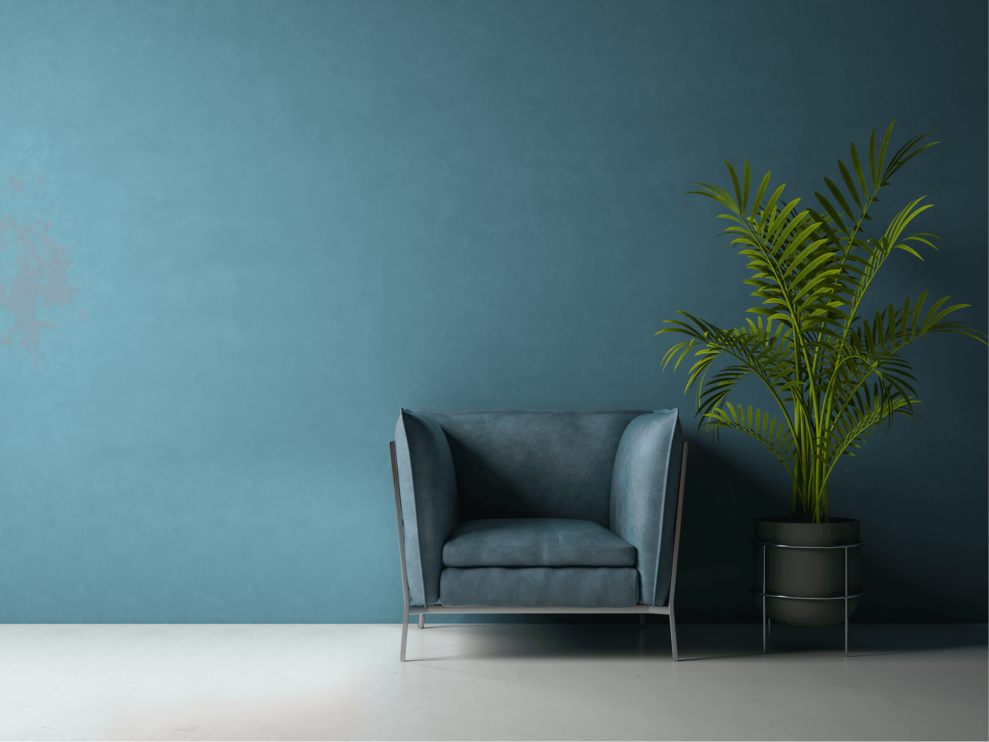
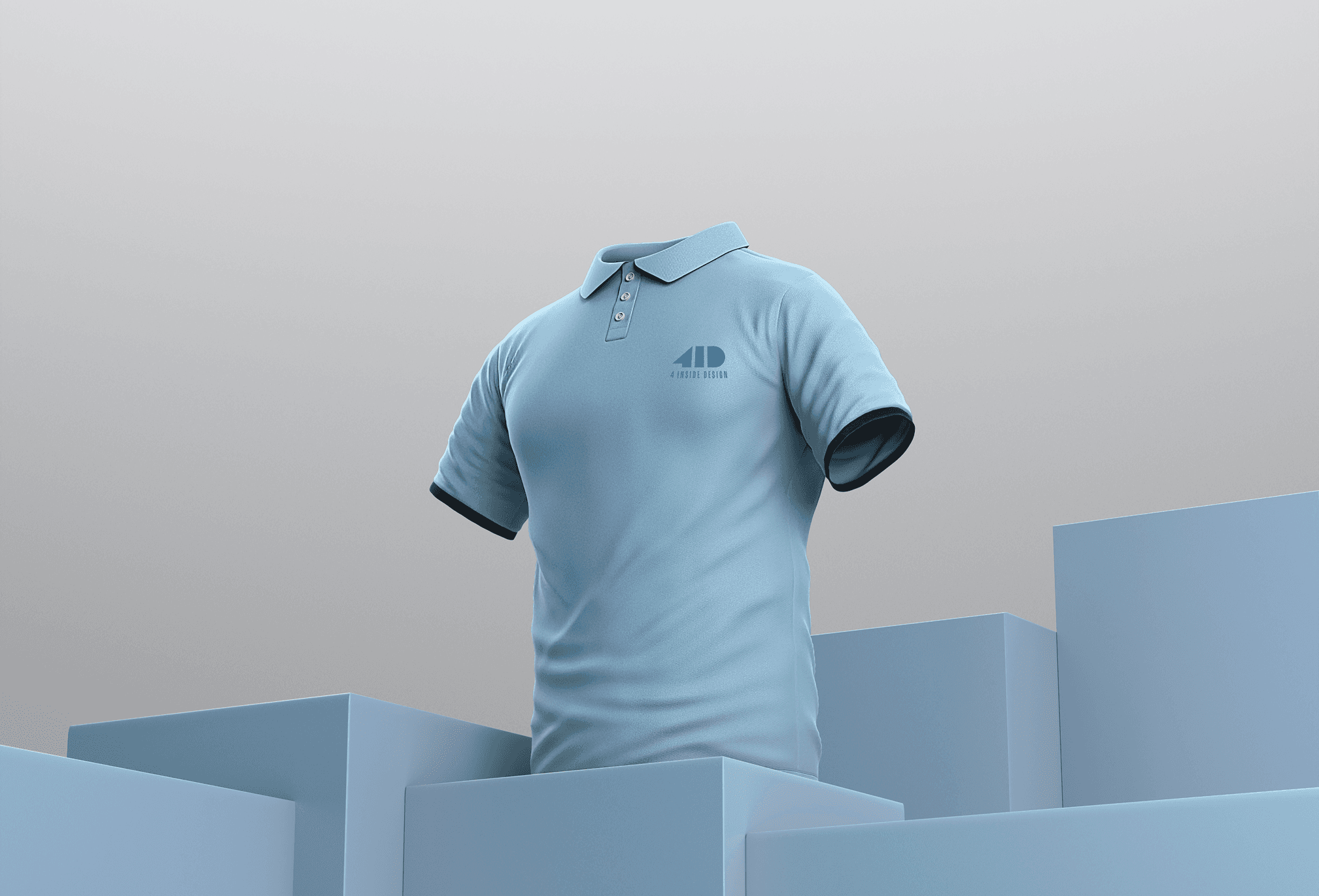
Design in Use

The identity was extended across real-world applications with consistency and intent — from uniforms and event kits to welcome folders, signage, and space branding. Each use case was built to feel considered and coherent, reinforcing the brand’s quiet sophistication while adapting seamlessly to homes, cafés, and commercial spaces alike.

This wasn’t just a visual upgrade — it was a strategic shift. 4 Inside Design now carries an identity that feels grounded, memorable, and built to evolve. It brings cohesion to every touchpoint, clarity to the brand story, and lasting recall for the people it’s meant to serve — those who value thoughtful design, even in the smallest of details.

Building something interesting? I’d love to help.

Copyright © akashranjan.com All rights reserved

Building something interesting? I’d love to help.

Copyright © akashranjan.com All rights reserved

Building something interesting?
I’d love to help.

Copyright © akashranjan.com

All rights reserved